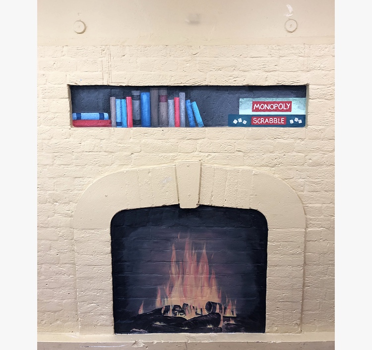
In the dining room of the care home is an old fire place which has been filled in. Once this would have been the focal point of the room, but it had been painted over to try and blend in with the wall and was rather insignificant now. They have no plans to turn itContinue reading "Fire place mural – Care Home, Elstree"
Hand-painted seascape mural – North London Hospice – Whetstone.
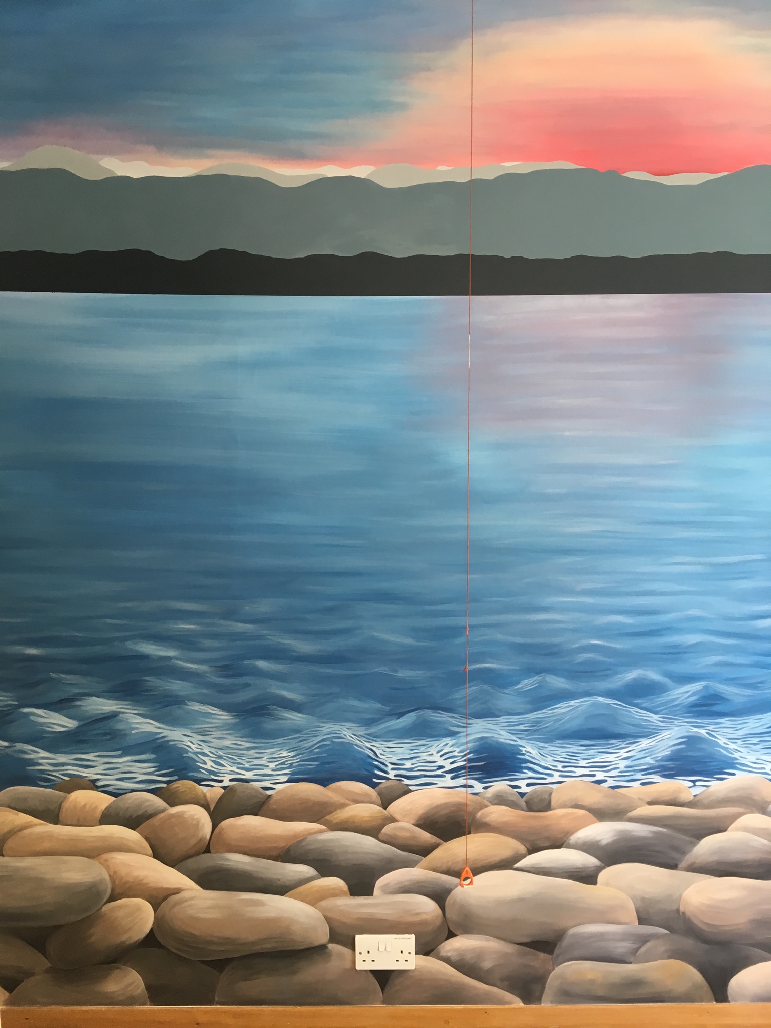
The aim of this mural was to allow it's viewers to imagine they were somewhere far away, somewhere peaceful and calm. I wanted to create a realistic seascape as the seaside is often associated with relaxation and feeling calm. To create a realistic seascape I needed to create depth within the painting so there wereContinue reading "Hand-painted seascape mural – North London Hospice – Whetstone."
Autumnal stenciled mural – Hertfordshire
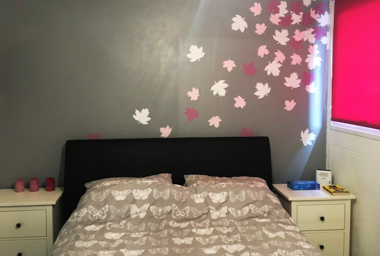
The colour scheme in this room is grey, white and dark pink. I designed a simple mural to fit in with this. I wanted it to represent nature but to be fairly decorative rather scenic. I wanted to create a feeling of movement in the mural so rather than a repetitive pattern I decided toContinue reading "Autumnal stenciled mural – Hertfordshire"
Golden Plaice – fish and chip shop, Borehamwood
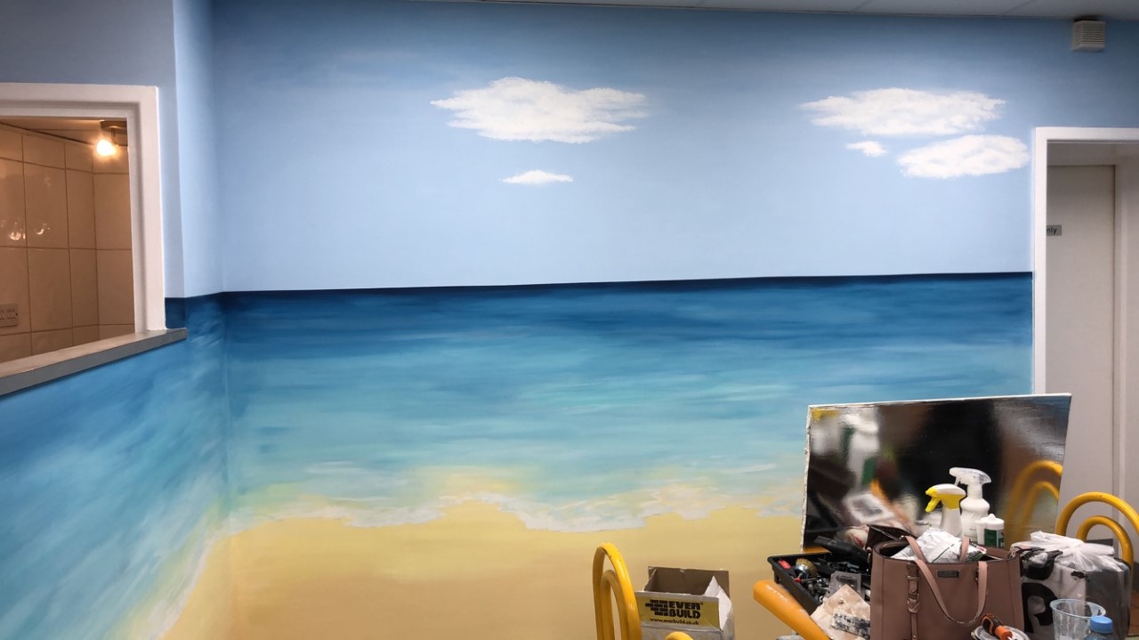
I was asked to paint some murals in Golden Plaice as part of a 2 week refurbishment that was taking place. The owner had large yellow panels along one wall that he wanted to be painted to look like water but with a waterfall in the middle. He also wanted the back wall to beContinue reading "Golden Plaice – fish and chip shop, Borehamwood"
Make your own Galaxy Painting!
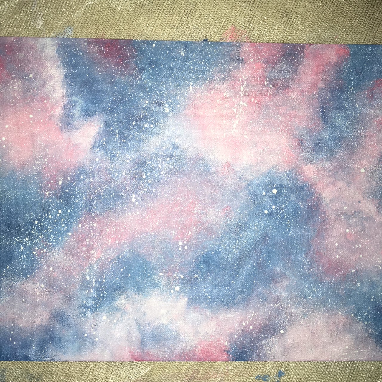
How to make a Galaxy Painting white paint2+ other coloured paints (I recommend blues, purples, pinks)A spongeA paintbrushA canvas/piece of card or paperA toothbrush/stiff paint brush (for flicking/spraying the white paint) If you look at an image of a galaxy you’ll notice different colours and tones, blending into each other. Where there is light you'llContinue reading "Make your own Galaxy Painting!"
2 Simple – Office mural
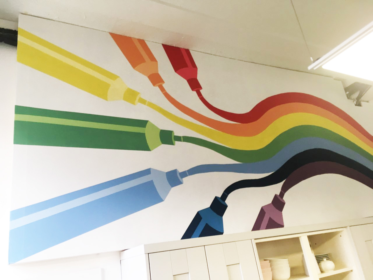
Quick summaryOffice Mural. The company makes learning software for primary schools and wanted the mural to match their brand. Rainbows are bright and colourful and linked nicely with their coloured pens (part of the software). They also have a 'coding monkey' who they wanted to feature in the design. I used my usual emulsion paintsContinue reading "2 Simple – Office mural"
